
Clear, current pet information
Adopters wanted detailed profiles, behavioural information, care needs, availability, and clearer guidance before making a decision.

02
UX/UI + Front-End · 2024–2025
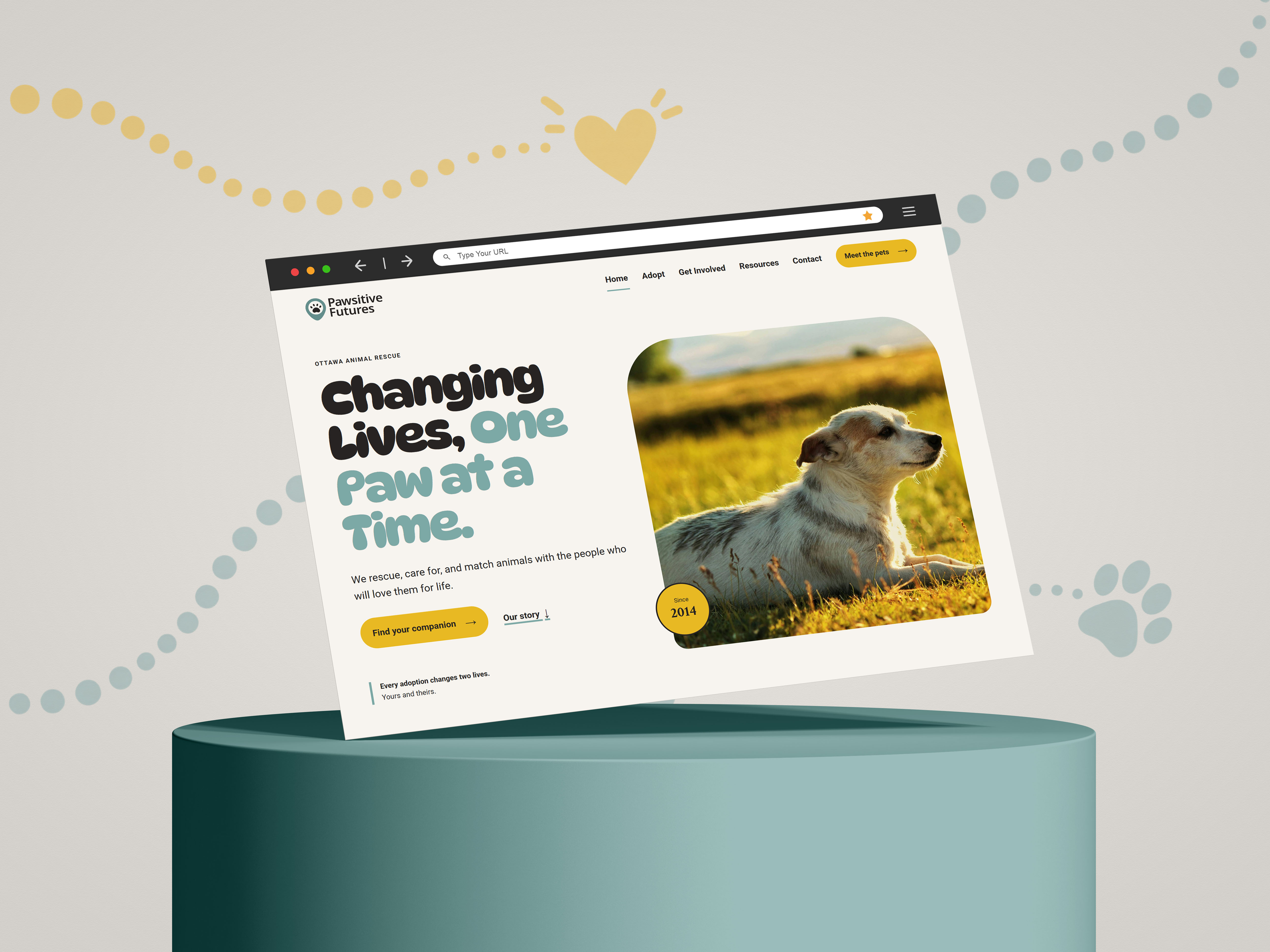
A responsive animal rescue website shaped by user research, designed to simplify pet discovery, adoption guidance, and community involvement across mobile, tablet, and desktop.
Research & Scope
9User Interviews
3Audience Groups
Mobile · Tablet · DesktopResponsive experience
The challenge was to create one clear experience for people arriving with very different goals, from finding a pet to fostering, volunteering, donating, or learning more about adoption. The experience also needed to stay easy to navigate across mobile, tablet, and desktop.
Tools used: Google Meet · FigJam · Figma
9 interviews were conducted on Google Meet across three audience groups.
3 Prospective Adopters
3 Staff & Volunteers
3 Supporters
The interview findings were grouped in FigJam to identify common needs around pet information, getting involved, trust, and navigation.
Adopters wanted detailed profiles, behavioural information, care needs, availability, and clearer guidance before making a decision.
Adoption, volunteering, and fostering all needed clearer steps, expectations, and supporting information.
Participants looked for reviews, success stories, regular updates, visible community activity, and clearer information about how support makes an impact.
I reviewed three animal rescue websites to understand how they handled pet discovery, community involvement, calls to action, and trust-building content.

What works Clear Donate and Featured Dog CTAs, visible navigation, impact metrics, and featured-animal storytelling made important actions and organizational impact easy to see.
Gap / opportunity Pet discovery could be stronger with clearer hierarchy, more detailed search and filtering, adopter testimonials, and additional educational content.
What works Strong Adopt, Donate, and Get Involved CTAs, community programs, accreditation information, and accessible navigation helped communicate credibility and participation opportunities.
Gap / opportunity The large amount of content created an opportunity for simpler navigation and clearer organization, with more adopter testimonials supporting the experience.
What works Emotional animal photography, a calm colour palette, simple navigation, and a distinctive Donate CTA created a welcoming and approachable experience.
Gap / opportunity Animal profiles needed more detail, while search, volunteer information, testimonials, FAQs, and educational content could make the experience more useful.
The review reinforced the need to combine emotional storytelling with practical discovery tools, clearer participation pathways, and enough information for users to act with confidence.
The interviews highlighted three audience groups, each with different goals and information needs.
I created three personas from the interview patterns to represent the main audience groups and keep their goals and needs visible throughout the design process.
Bola Adedapo
Wants to find a suitable pet and feel confident about the adoption process.
Needs
Detailed pet profiles, behaviour and care information, clear adoption guidance, and trustworthy shelter information.
Jim James
Wants to understand where help is needed and how to get involved.
Needs
Clear volunteer roles, expectations, application steps, training resources, and up-to-date opportunities.
Keisha Jing
Wants to support animal welfare and understand how their contribution makes an impact.
Needs
Clear donation and sponsorship options, community opportunities, regular updates, success stories, and transparency around impact.
To look more closely at the volunteer experience, I mapped Jim’s journey from exploring animal shelter websites to applying for a volunteer role.
The Pain Points row showed where Jim faced friction at each stage. During Explore, some websites did not have a clear section for volunteer opportunities. During Research, role details and application instructions were limited. During Apply, unclear application processes and limited volunteer experiences made it harder to move forward with confidence.
These findings helped shape the design priorities explored in the next section.
Research findings were grouped into three priorities that shaped the refined experience.
Prospective adopters wanted an easier way to find pets and enough information to know if a pet might suit their home.
Added search and Dogs, Cats, and Rabbits filters, result counts, feedback states, and detailed pet profiles with breed, size, personality, energy level, compatibility, care needs, health, and ideal home information.
Volunteers and foster caregivers needed clearer information about roles, expectations, requirements, training, and how to take the next step.
Created a dedicated Get Involved experience with volunteer role details, time commitments, training information, a clear four-step process, foster and donation paths, and a Volunteer with us action linked to the interest form.
Participants looked for success stories, community activity, useful resources, and clearer ways to understand and connect with the rescue.
Added success stories, downloadable guides, events and workshops, FAQs, support options, and direct contact pathways.
Tool used: FigJam
The original sitemap had several separate top-level sections, so I simplified the structure around the three audience groups identified in the research. Adopt supports prospective adopters, Get Involved brings volunteer, foster, and donation paths together for volunteers and supporters, and Contact gives all users a direct way to reach the rescue.
Resources sit within Adopt because the guides, workshops, and FAQs mainly support people learning about adoption. A Resources link also remains in the main navigation so users can access that content directly.
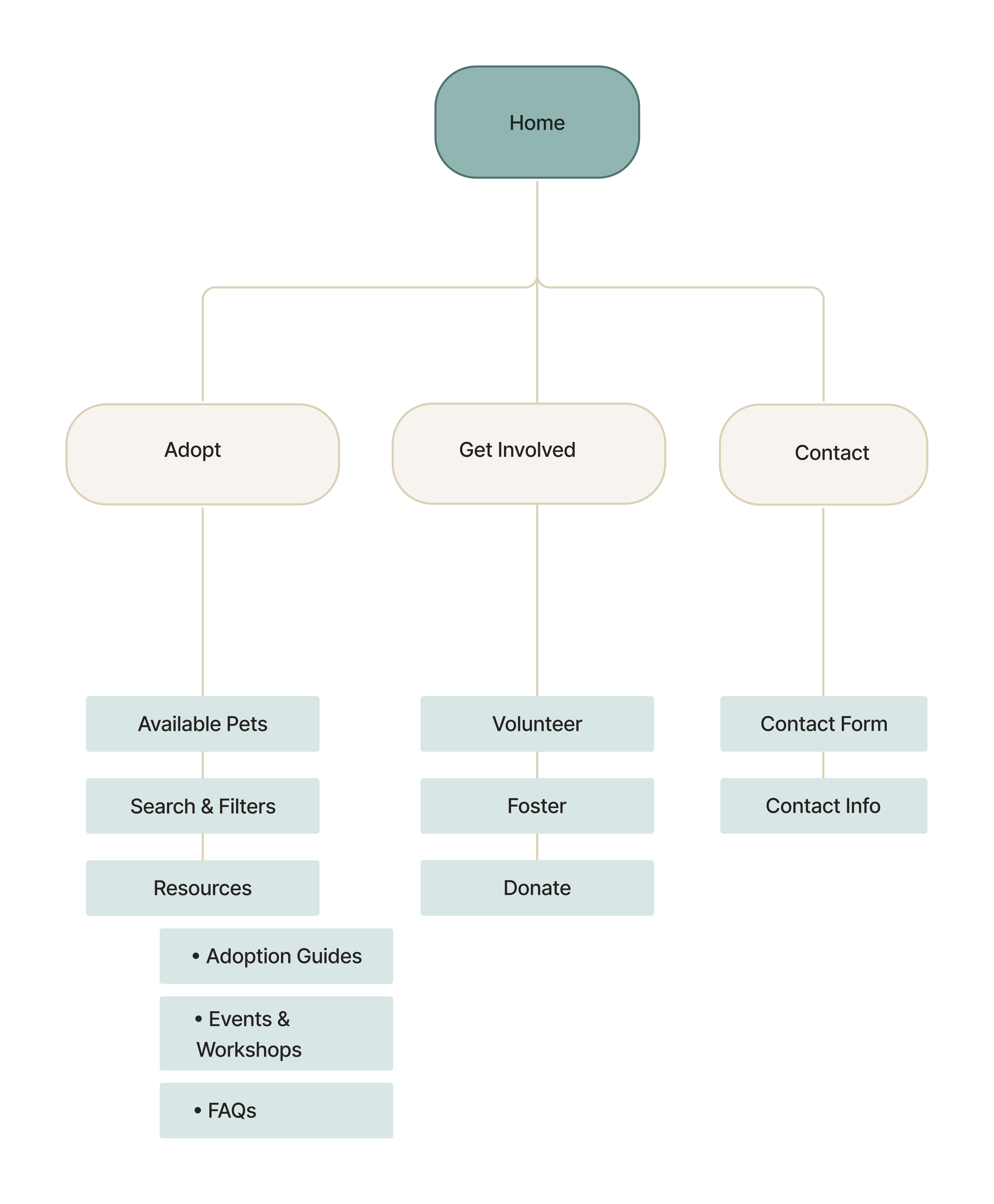
The final structure keeps the main paths clear while still supporting the different goals identified in the research.
Tool used: Figma
Low-fidelity wireframes helped establish page hierarchy, content placement, and responsive layouts before moving into visual design.
The early layouts focused on making pet discovery, adoption information, and ways to get involved easy to find across screen sizes.
Tools used: Figma · Adobe Illustrator
The original moodboard established a warm, approachable direction that remained the visual foundation of the project through the later refinement.
The style tile translated that direction into typography, colour, imagery, and interface treatments that continued to guide the 2026 redesign.
The moodboard helped spark the idea for the logo. I kept coming back to the feeling of “finding a home,” so I combined a paw with a location pin in Adobe Illustrator. I paired it with the Inter typeface to keep the name clear, friendly, and easy to recognize.

The first coded version established the visual foundation across Home, Adopt, and Contact.
The interface was later refined and expanded in 2026, while the original visual direction and core brand language remained consistent.
Tools used: Figma · In-person focus group
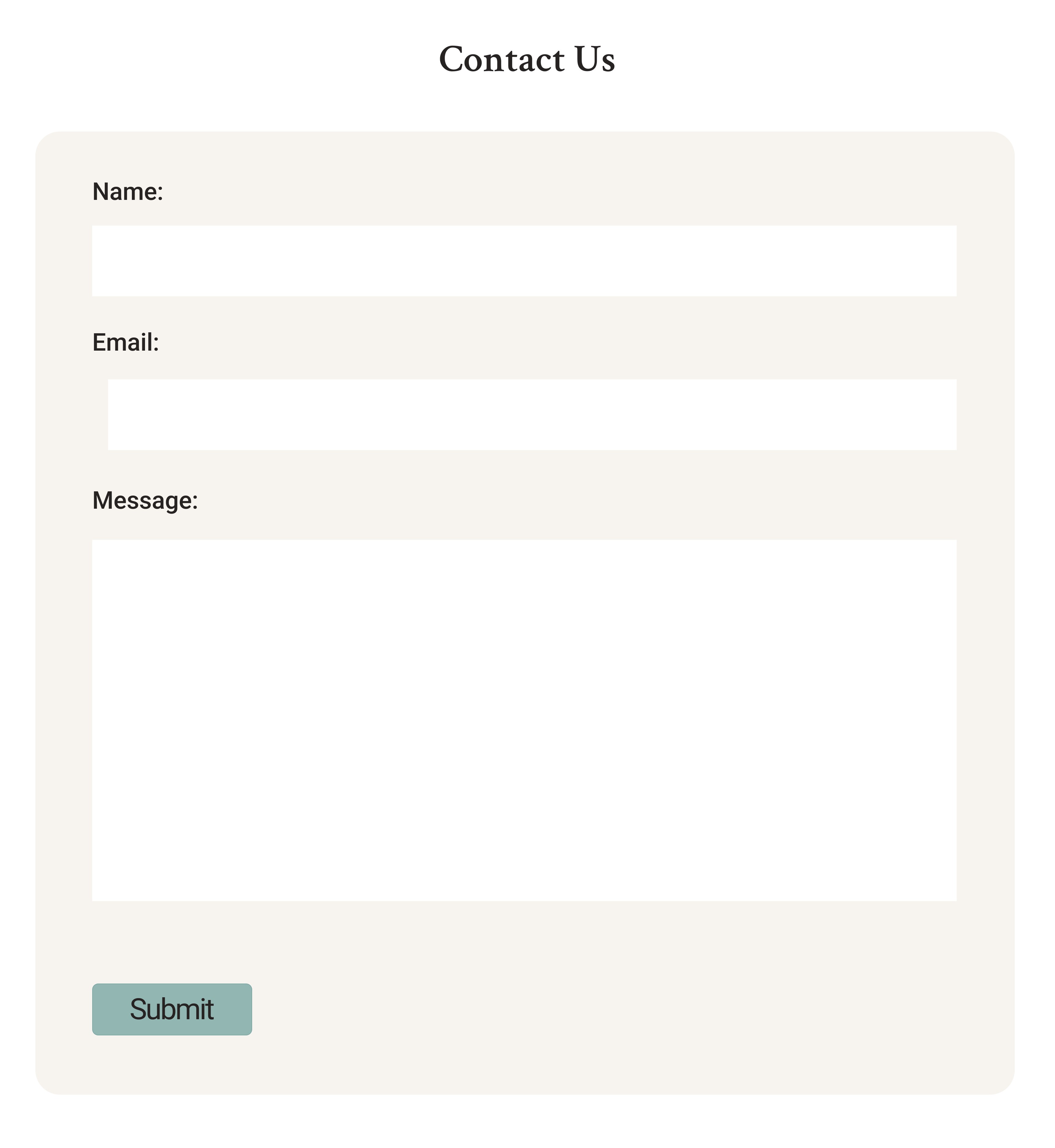
After the first version was built, the interface was presented to a 25-person peer focus group in person, with the design shared through Figma. Their feedback, combined with a further design review, highlighted four areas to improve: colour hierarchy, CTA visibility, visual engagement, and contact-form clarity.
Sections needed stronger visual distinction.
Buttons needed more prominence and consistent states.
The interface needed stronger supporting visual elements.
The contact form needed clearer definition.
Similar background treatments made some sections blend together.
Primary actions needed stronger prominence and more consistent button treatment.
Text-heavy sections needed stronger supporting visual elements.
The contact form needed clearer definition as the page’s main action.
Tools used: Lovable · Figma
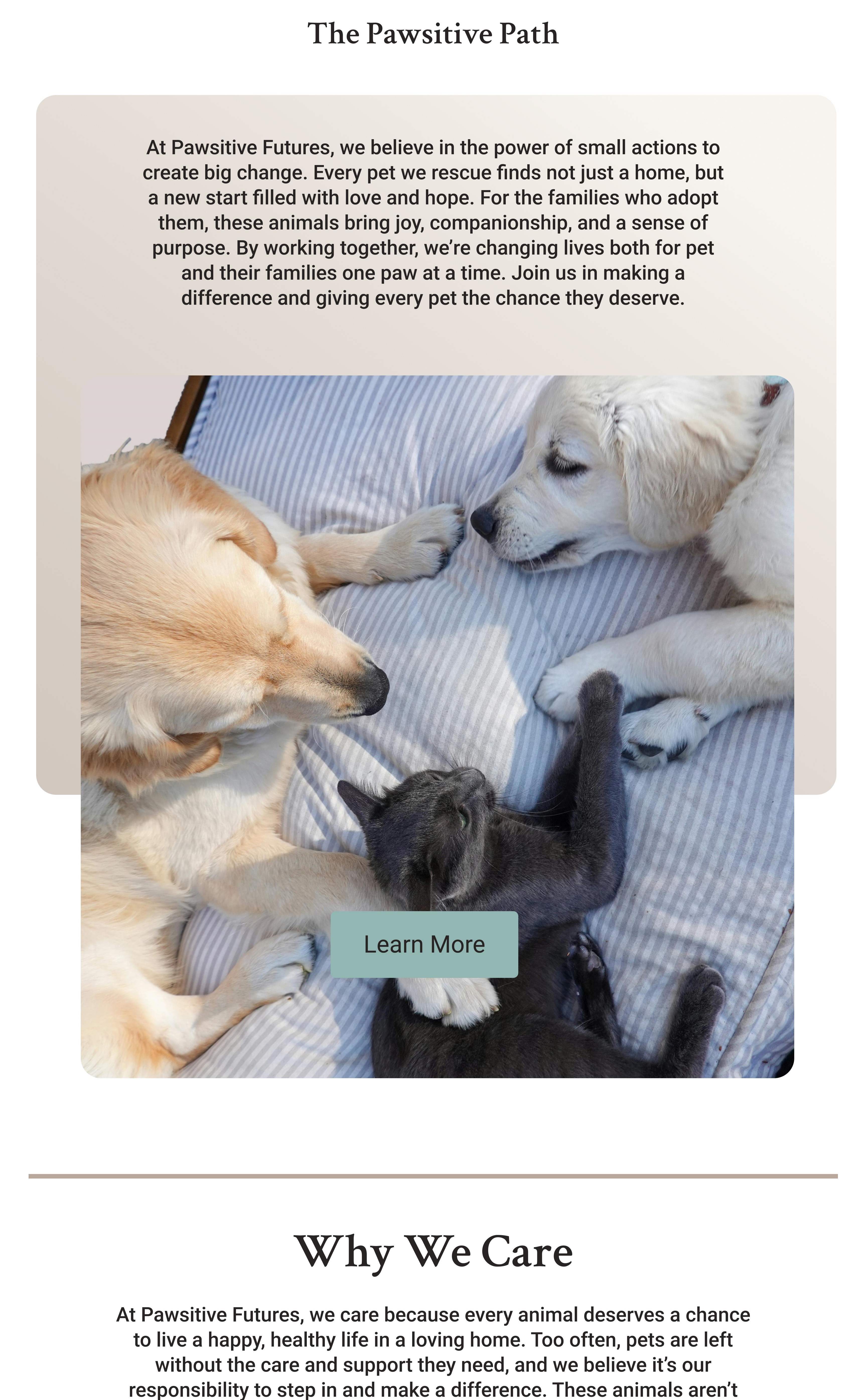
In 2026, I revisited the interface to address the focus-group feedback while keeping the original visual direction and brand language intact.
For the visual direction, I kept coming back to the moodboard image of the dog surrounded by a playful dotted trail. I liked how it made a static photo feel more lively and warm, so I reworked that idea into a journey motif using the Pawsitive Futures colours and paired it with editorial pet crops.
I used Lovable to quickly explore different interface directions, then brought the strongest ideas into Figma and refined them to fit the Pawsitive Futures brand, research findings, and focus-group feedback.
This exploration helped test:
This exploration helped test:
This exploration helped test:
I treated the AI outputs as starting points. I pulled useful ideas around storytelling, hierarchy, imagery, and calls to action into Figma, then adapted them to the existing brand and final experience.
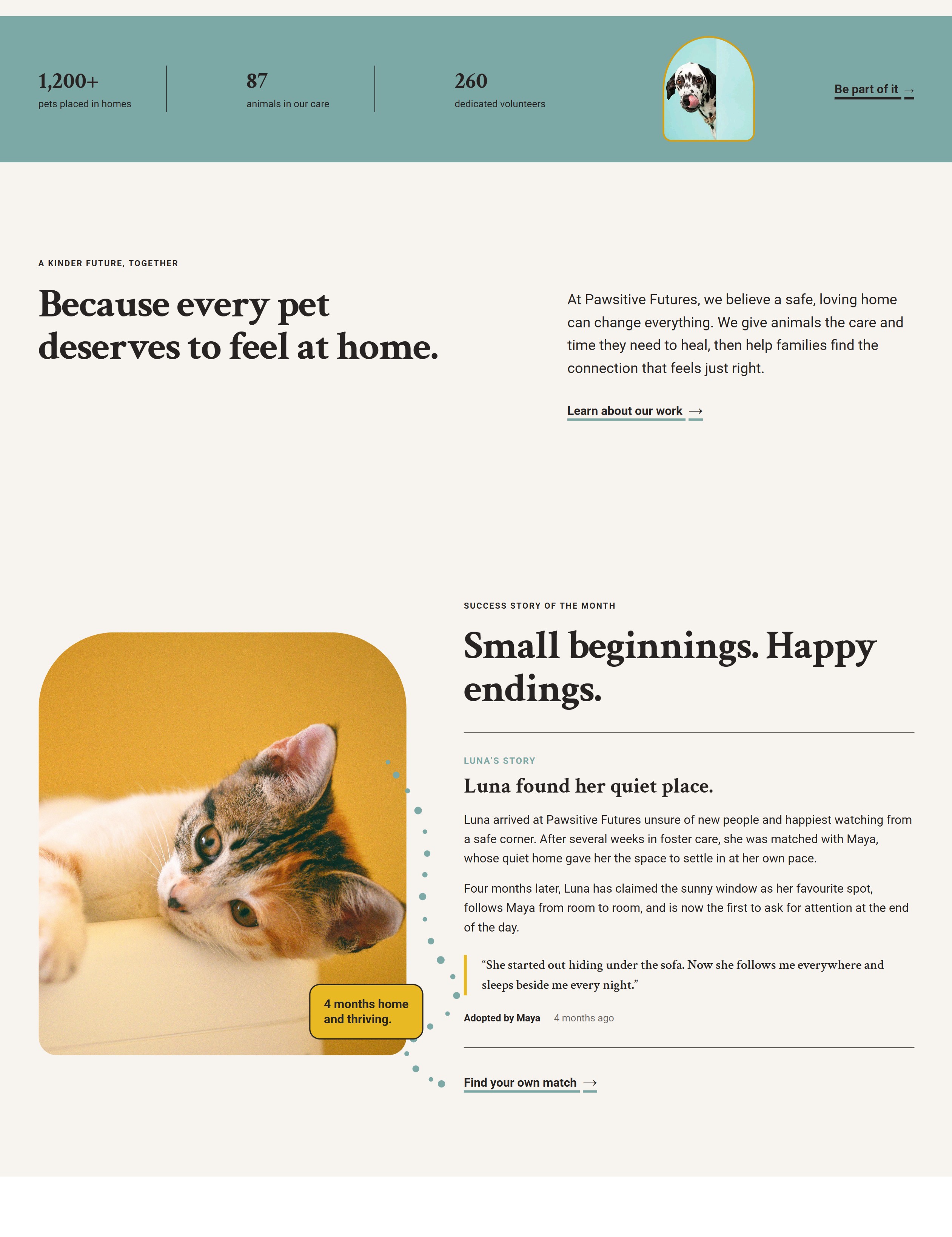
Refinement:
Introduced clearer background changes, spacing, dividers, and content groupings to give sections stronger visual distinction.
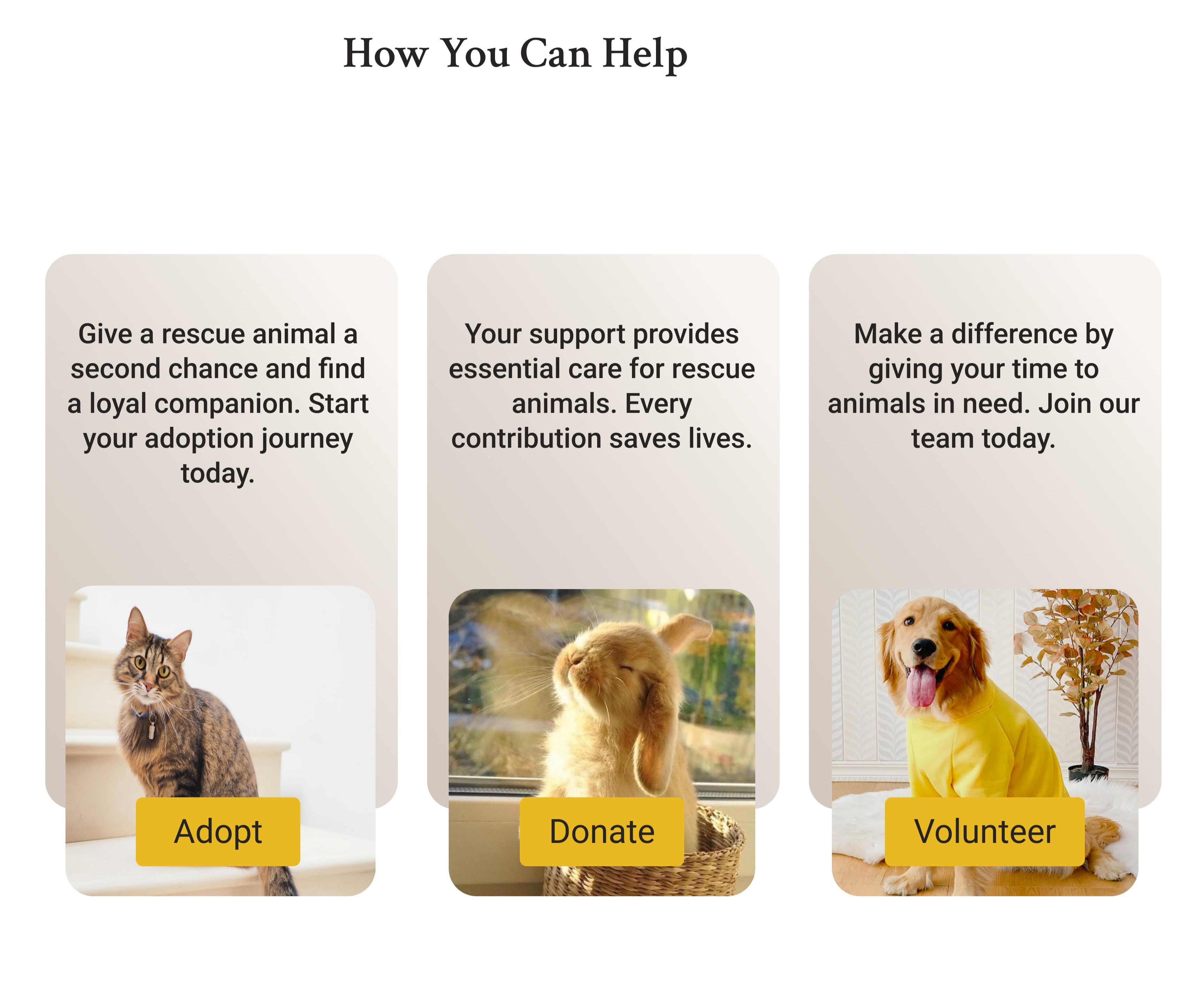
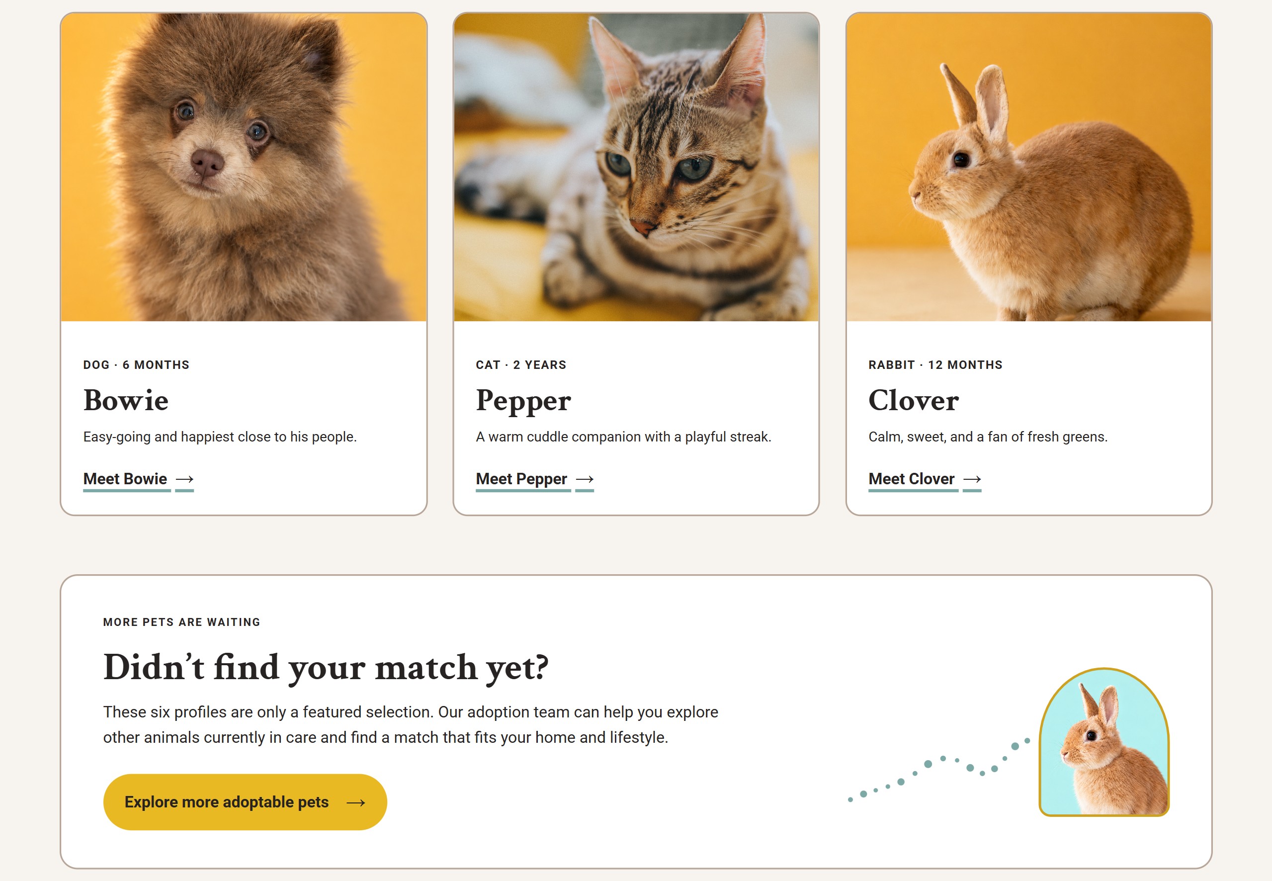
Refinement:
Standardized primary and secondary action treatments to create a clearer and more consistent hierarchy across the experience.
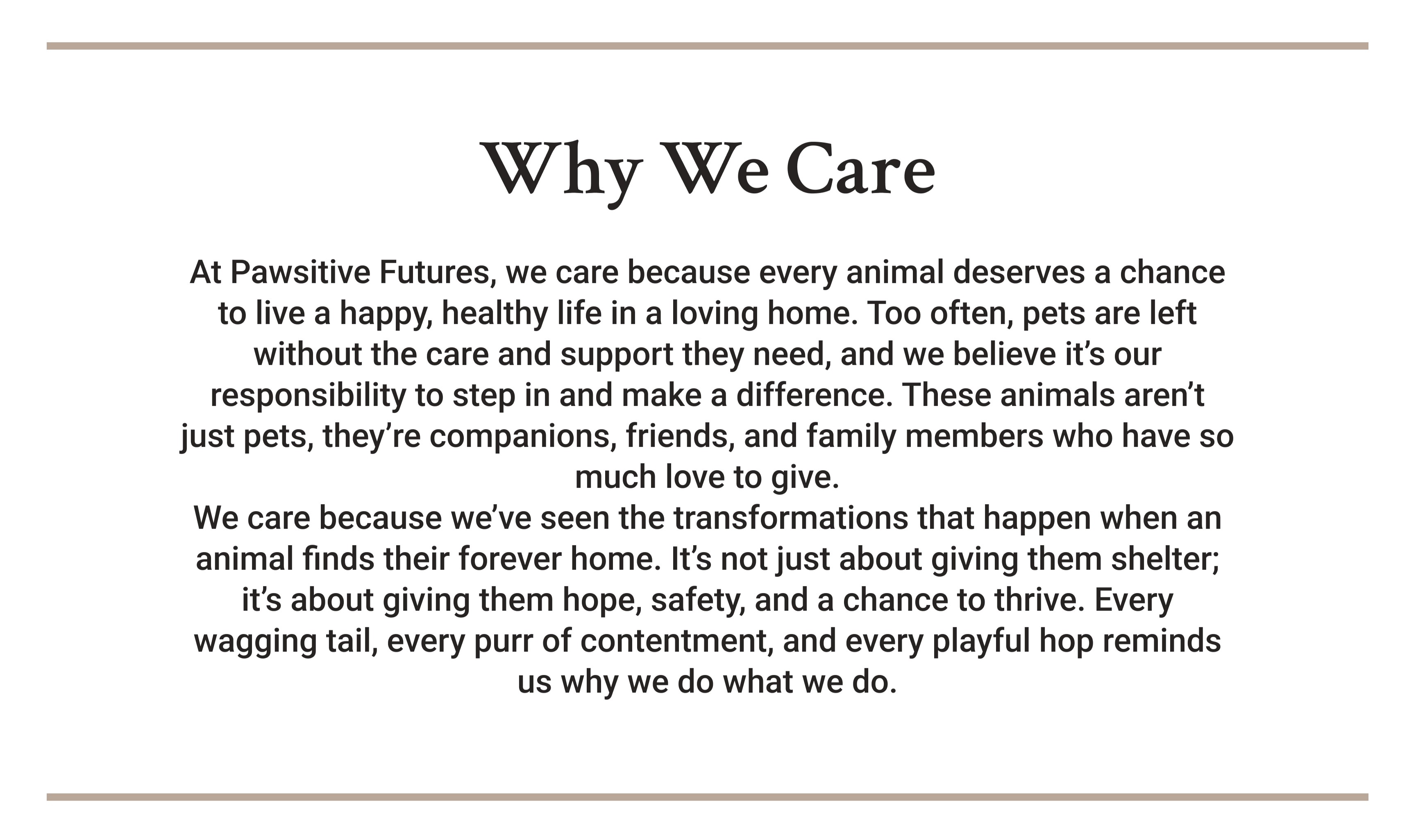
Refinement:
Expanded photography, editorial pet crops, success stories, and supporting visual elements to reduce text-heavy sections.
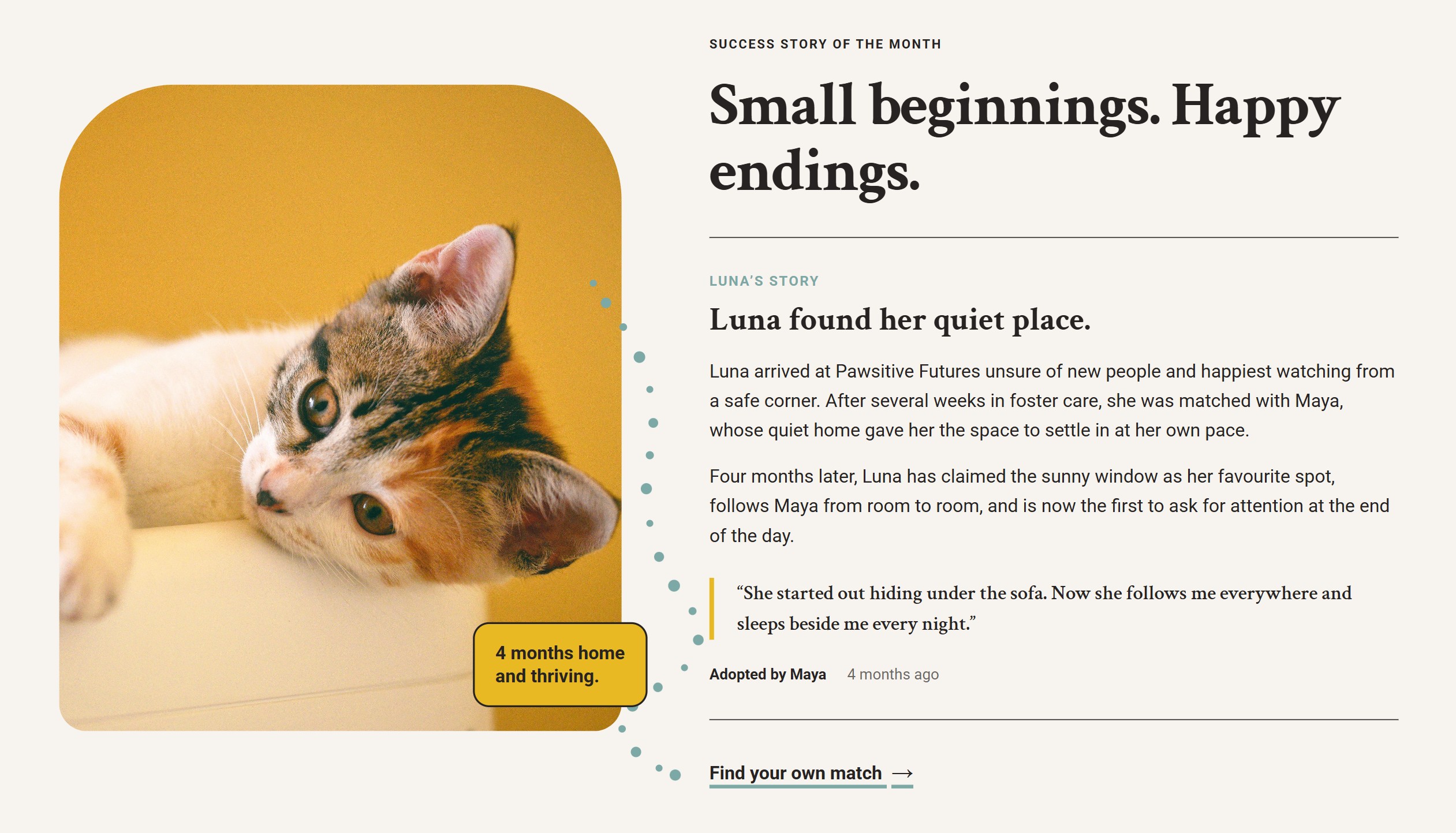
Refinement:
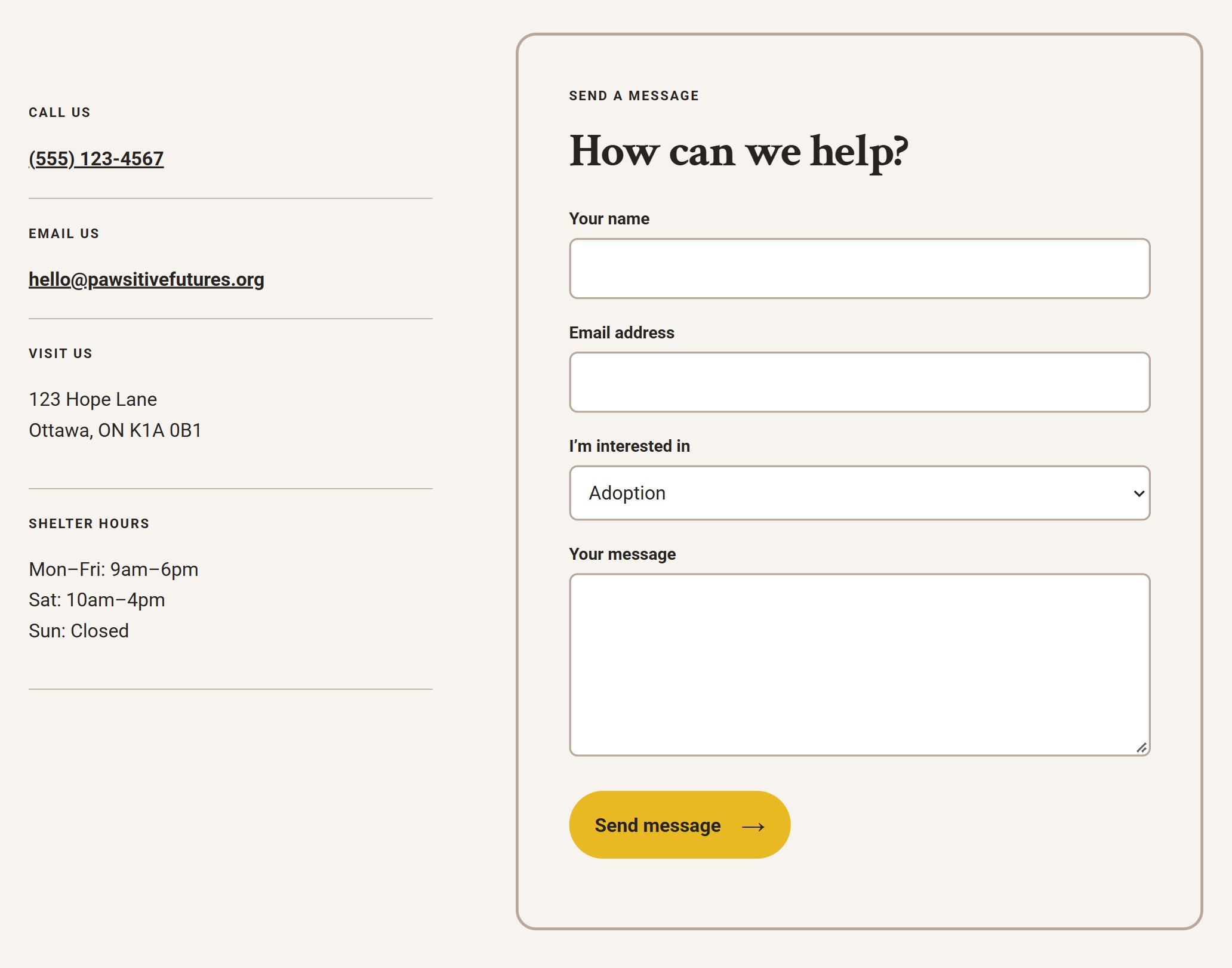
Separated contact information from the enquiry form and gave the form clearer definition as the page’s primary action.
The final experience brings pet discovery, adoption guidance, resources, and ways to get involved together across desktop, tablet, and mobile.
The layout was adjusted for desktop, tablet, and mobile. Columns reduce as the screen gets smaller, content stacks where needed, and controls remain easy to use on smaller screens.
The desktop navigation changes to a compact menu on smaller screens to reduce crowding.
The hero and content sections stack on smaller screens, while selected editorial pet crops remain as part of the visual identity.
Pet cards move from three columns to two and then one. Filters adapt to smaller screens, while detailed pet profiles remain easy to scan on mobile.
Volunteer roles and participation content stack on smaller screens. The four-step volunteer journey also uses a longer mobile path so all four stages remain connected.
Contact information and the enquiry form sit side by side on desktop and stack on smaller screens.
I built the refined design as a responsive website using HTML, CSS, and JavaScript, then deployed it with GitHub Pages.
HTML · CSS · JavaScript
Git · GitHub · GitHub Pages
The build included responsive navigation, reusable styling, pet search and filtering, result feedback, form interactions, and pet-profile modals.
Default state with all six featured pets visible.
Dogs selected, reducing the results to the two matching pets.
A search with no matches, showing the result count and empty-state feedback.
JavaScript handles pet search, category filters, result counts, and feedback when no matches are found.
Selecting a pet opens a detailed profile with key information about the animal.
The “I’m interested in…” button takes the selected pet into the adoption enquiry form.
Pawsitive Futures grew from an initial three-page website into a more complete responsive experience for adopters, volunteers, foster caregivers, and supporters.
View Live Website ↗Building the first version showed how responsive behaviour, content density, and visual hierarchy can reveal issues that are less obvious in static mockups. Revisiting the project also showed the value of using feedback to improve an existing experience rather than starting over.
If I continued the project, I would test the refined experience with users and explore connecting pet information and forms to a live backend.