
The brand lacks a consistent system
The current identity has character, but it is not used consistently across the website and other brand materials.

03
Brand + Web - 2025
613Flea is a not-for-profit Ottawa marketplace redesigned with a clearer brand identity and a more engaging digital experience for visitors and vendors.
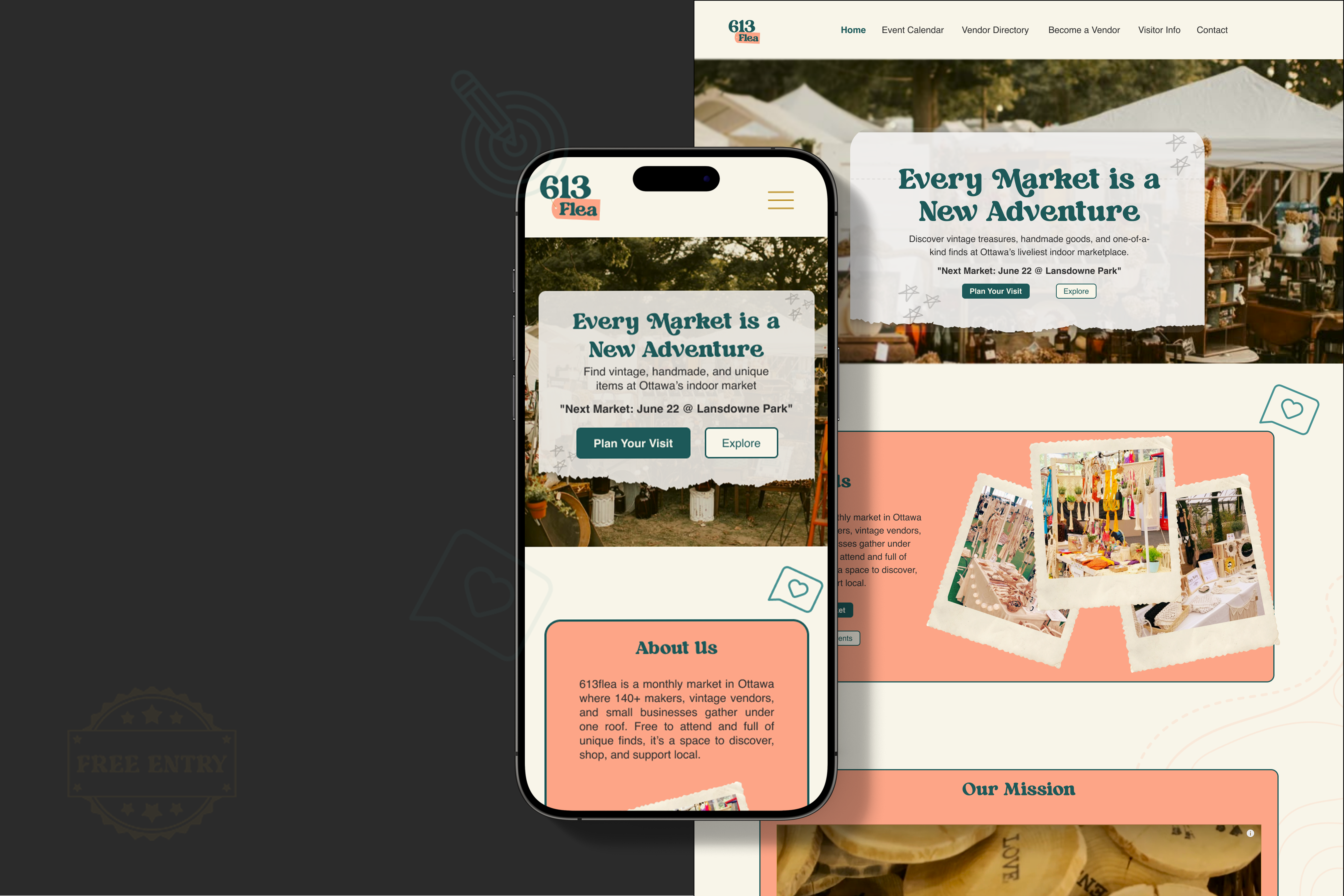
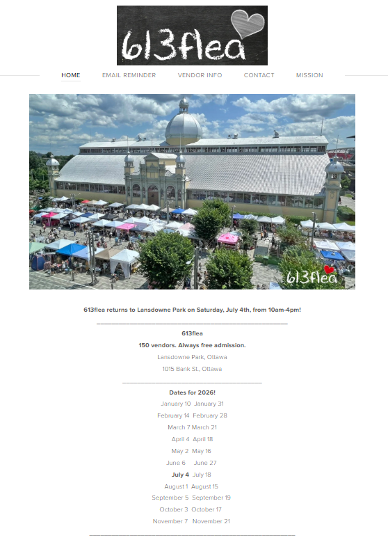
The current homepage has a handmade market feel, but needs clearer hierarchy, stronger visual structure, and a more flexible brand system.
2 rounds of Maze usability testing · 12 participants in Round 1 · 16 after iteration
01 / The Problem
At the time of the redesign, 613Flea already had a strong local presence, but its website and branding did not fully reflect the energy of the market. The visual identity was inconsistent, visitor information lacked a clear structure, and there was little opportunity to discover vendors before attending.
The current website contains important market and vendor information, but much of it is spread across text-heavy pages with limited visual hierarchy or ways to explore the market.
Click an image to view full size
The current identity has character, but it is not used consistently across the website and other brand materials.
Event dates are available, but details such as parking, accessibility, and other visit information are not grouped in one clear visitor section.
Visitors have little opportunity to explore vendors before attending the market.
Refresh the 613Flea brand and website while keeping its local character, making visitor information easier to find and giving people a better way to discover vendors before market day.
02 / Research
Tools used: FigJam · Figma
Research focused on understanding 613Flea’s brand, audience, competitors, and the gaps in the current website.
A detailed creative brief was created to define the audience, brand direction, project goals, and website needs. I designed the final brief document used to organize and present the research.
A competitor review looked at how other marketplaces handled event information, vendor discovery, branding, and visitor planning.
A dedicated events calendar makes upcoming events visible.
The site lacks a year-round vendor directory.
Website text is easy to read.
Visitors cannot search for a specific vendor.
The market is positioned as a full day-trip experience, giving visitors a clear sense of what to expect.
The visual design feels more like a tourism brochure than a modern retail experience.
Together, the brief and competitor review highlighted three areas to focus on in the redesign.
Visitor information needed a clearer place in the website structure.
Visitors needed more ways to explore vendors before market day.
The website needed to feel more like the lively, local experience of the physical market.
The redesign also needed to work for three practical groups: people discovering the market, vendors looking to participate, and visitors planning their first trip.
Want to understand what is happening and discover vendors before attending.
Need clear application information and better visibility.
Need practical details to plan their visit with confidence.
03 / From Needs to Solutions
The audience needs identified during research were translated into three design responses that shaped the redesign.
Want to understand the market, discover vendors, and get a feel for the experience before attending.
Use market imagery, vendor highlights, and lifestyle-focused sections to communicate the atmosphere before visitors arrive.
Need a clear way to apply and better opportunities to be discovered by shoppers.
Create clearer application steps and introduce vendor profiles, categories, and featured vendor content.
Need practical information before deciding when and how to visit.
Bring parking, transit, accessibility, food, washrooms, and first-time visitor information into one clear planning area.
04 / Structure
Tools used: FigJam · Figma
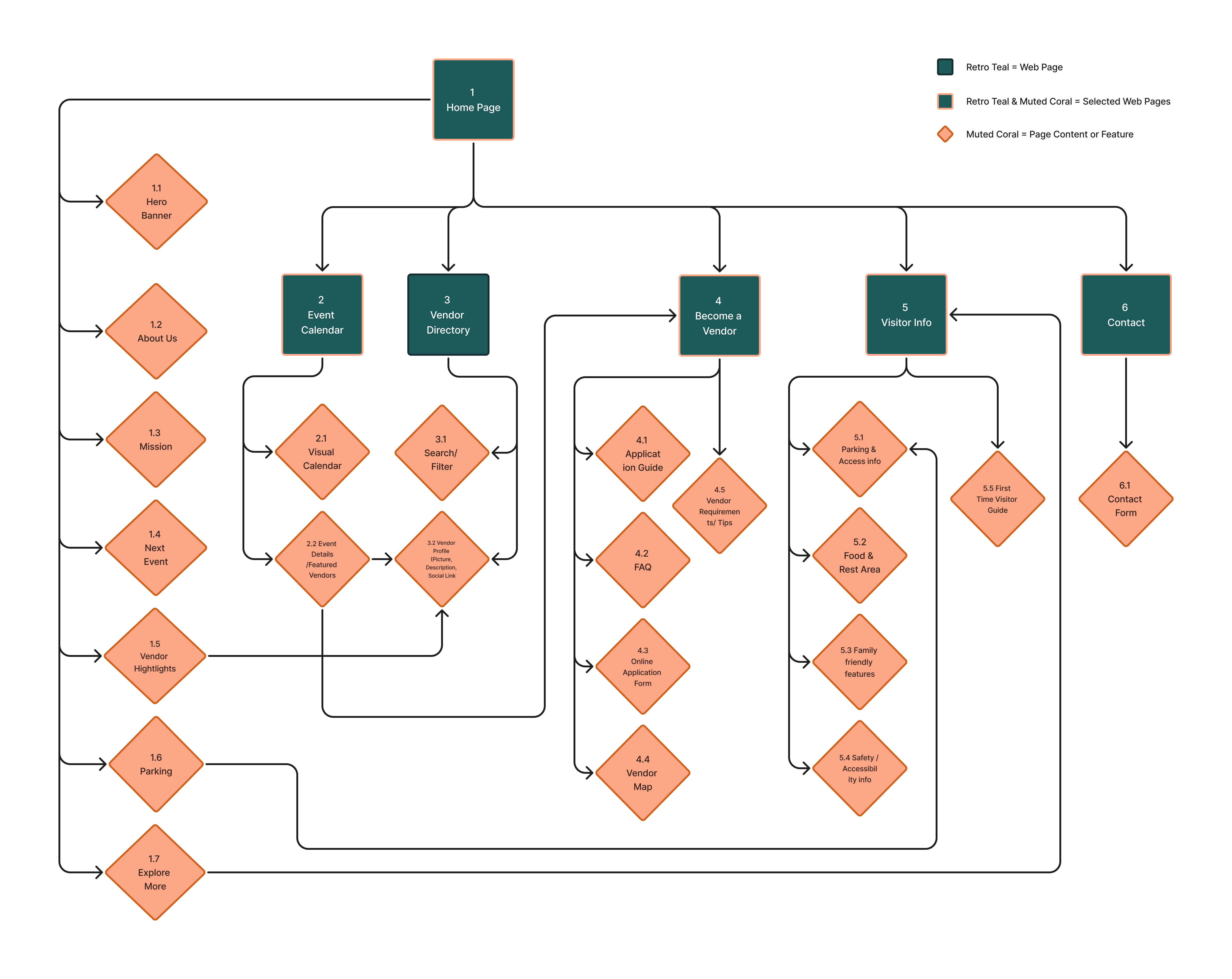
The website was organized around five core areas: Home [1.0], Event Calendar [2.0], Vendor Directory [3.0], Become a Vendor [4.0], and Visitor Info [5.0].
This keeps visitor planning and vendor discovery close to the homepage while giving vendors a clear path to application information.
05 / Early Design
Tool used: Figma
Low-fidelity wireframes were used to translate the sitemap into responsive desktop and mobile layouts, focusing on hierarchy and access to the information identified during research.
Upcoming market information was given stronger hierarchy.
A clearer path was created for browsing vendors before attending.
Practical visit information was grouped into a dedicated area.
06 / Visual Direction
Tools used: Adobe Illustrator · Photoshop · Figma
The visual direction kept 613Flea’s playful, local character while making the brand more consistent, flexible, and easier to use across digital and physical touchpoints.
The logo development moved from the existing handmade mark into a more flexible visual system. Each stage helped clarify how the brand could feel playful and market-friendly while becoming more scalable for responsive digital use.

Old / Current Logo
The original logo had a handmade, local-market feel that matched 613Flea’s community personality. However, it was harder to scale across website layouts, signage, social media, and vendor materials because the mark was more image-based and less flexible as a brand system.
Version 1 Logo
This version explored a circular badge style to reflect the vintage and handmade feel of the market. It felt warm and market-friendly, but the detailed stitched edge and compact layout made it less flexible at smaller sizes or in responsive digital spaces.
Final Version Logo
The final logo kept the playful flea market character while improving readability and flexibility. The larger 613 strengthens recognition, while the tag-style Flea adds a marketplace feel without making the mark too busy. This direction works better across web, social, print, signage, and event materials.
After choosing the final logo direction, I created supporting variations so the identity could stay consistent across different use cases, including dark backgrounds, social posts, event materials, vendor tags, and compact badge placements.
Dark Version
This version keeps the logo usable on dark layouts, posters, social graphics, and high-contrast promotional materials.
Badge Version
The badge variation gives the brand a compact mark that can work for stickers, vendor tags, social icons, merch, and event materials.
Basic usage guidelines were created to keep the logo consistent across different sizes, backgrounds, and applications.
The moodboard combined vintage market character with a cleaner, more contemporary visual style, using playful imagery, warm colour, and casual lifestyle references.
#1D5959
Supports the modern-vintage identity and main brand presence.#FDA587
Adds warmth, friendliness, and market-inspired energy.#F8F5E9
Keeps the layout soft, clean, and approachable.#E2BB45
Used for high-contrast call-to-action moments.#BA9FD0
Adds playful contrast and supports secondary highlights.Tropical Magic adds the playful, vintage character of the market, while Helvetica keeps longer information clear and easy to read.
07 / Final Experience
Tool used: Figma
The final redesign brings event discovery, vendor participation, and visit planning into a clearer, more cohesive experience across mobile and desktop.
08 / Testing
Tool used: Maze
The prototype was tested in Maze across two rounds. Round 1 included 12 participants, and 16 participants completed Round 2 after the design was updated. Three tasks focused on event information, vendor discovery, and the vendor application process.
Find the date and location of the next market from the homepage.
Up from 75%
Go to Explore the Market and find a way to view a vendor profile.
Up from 75%
Find the requirements and steps to apply as a vendor.
Successful completion
01“I love the vibe, but took me awhile to actually see the market info down below.”
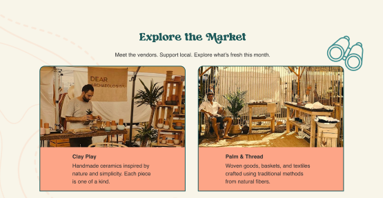
02“I wasn’t sure if I could click the photos for vendors.”
03“I found the Become a Vendor link quickly, all the information I needed was present. Great!”
09 / What Changed
Tools used: Maze · Figma
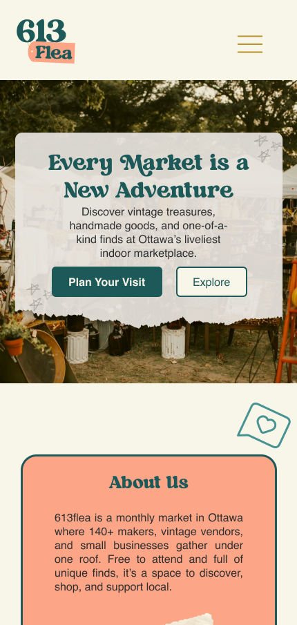
Testing highlighted two areas that needed improvement. The design was updated and tested again.
ISSUE 01
Participants could find the market information, but some took too long to notice it. The date and location were moved into the hero, improving task success from 75% to 100%.
 01
01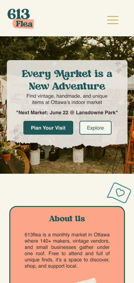 01
01ISSUE 02
Some participants were unsure whether the vendor images could be clicked. Clearer View Vendor buttons were added, improving vendor discovery from 75% to 95%.
 02
02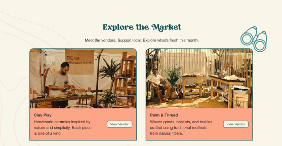 02
0210 / Outcome
The final redesign concept gave 613Flea a clearer visual identity and more direct paths to event information, vendor discovery, and visit planning. Across two rounds of Maze testing, event information improved from 75% to 100% task success, while vendor discovery improved from 75% to 95%. The vendor application task reached 100% completion.
A year-round directory would allow visitors to discover and shop from vendors even when the market is not running.
A self-service system could let vendors manage their profiles and applications, reducing manual work for the team.
A live map or wayfinding feature could help visitors navigate the 150+ vendors during busy events.
613Flea Case Study
by Esther Odeyemi