
Too many separate controls
Users have to move between different apps and device systems to manage everyday tasks.
01
Product Design - 2025–2026
Omvia brings smart-home routines, devices, safety, and caregiving into one calm, clear interface, making everyday home management easier without jumping between multiple apps.
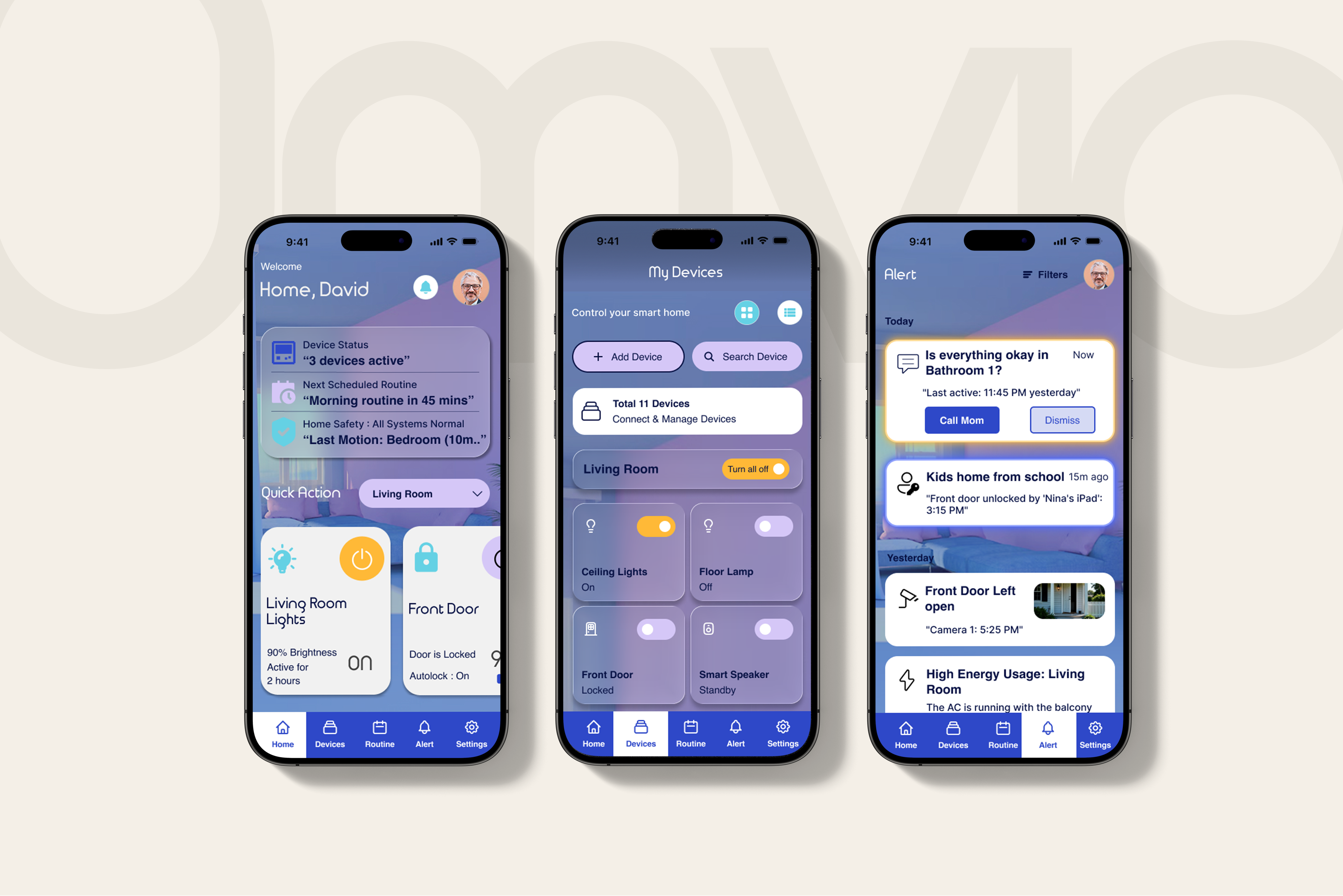
Maze usability testing
01 / The Problem
Smart home technology should make daily life easier, but managing multiple apps, devices, routines, and alerts can quickly become another source of stress.
Users have to move between different apps and device systems to manage everyday tasks.
Safety and home-status updates can be buried when users need reassurance quickly.
Families need ways to check on loved ones without turning the home into a surveillance system.
Create one calm, easy-to-use smart home experience that supports everyday routines, remote safety, and caregiving without adding more complexity.
02 / Research
Tools used: FigJam · Figma
Research began with a review of existing smart-home products and early problem-framing exercises. The goal was to narrow the broad smart-home space into specific situations where a more focused experience could be useful.
Google Home and Samsung SmartThings were reviewed to understand how established products organize devices, routines, alerts, and home controls.
What works Strong device integration across a broad smart-home ecosystem.
Gap / opportunity Routine information and common actions can become buried across multiple layers.
What works Powerful automation and deep control for advanced users.
Gap / opportunity The technical depth can make everyday tasks harder for less technical users.
Both products offered strong device control, but managing a connected home could still involve moving between devices, rooms, settings, and alerts. This created an opportunity to make everyday home management feel more focused and easier to understand.
A problem-framing exercise explored who might experience friction, when it could happen, and which situations were worth examining more closely.
Three situations were explored further to understand the different needs that could shape the experience.
Busy households may need a quicker way to manage repeated actions across several devices.
Homeowners may need an easier way to check important home information and control devices remotely.
Family members may need useful updates and remote support without constantly monitoring someone.
1 FOCUS GROUP SESSION
Before moving into wireframes, an early focus group was used to validate whether the personas, problem framing, and smart-home concept aligned with the needs identified during research. The discussion reinforced the value of centralized control while highlighting areas that needed more clarity, including access permissions, emergency support, and independence for older users.
One simpler place to manage connected home devices.
Roles and access needed clearer boundaries.
Older users should remain in control while still being able to give family access when needed.
03 / From Needs to Solutions
The three focus areas were translated into product decisions that shaped Omvia’s core experience.
Everyday routines
Manage a busy home without jumping between apps.
Turns scattered device controls into one clearer household flow.
Away from home
Get quick reassurance without digging through the app.
Makes important safety information easier to understand from a distance.
Supporting a loved one
Know a loved one is safe without intrusive monitoring.
Supports caregiving with reassurance, not surveillance.
04 / Structure
Tool used: FigJam
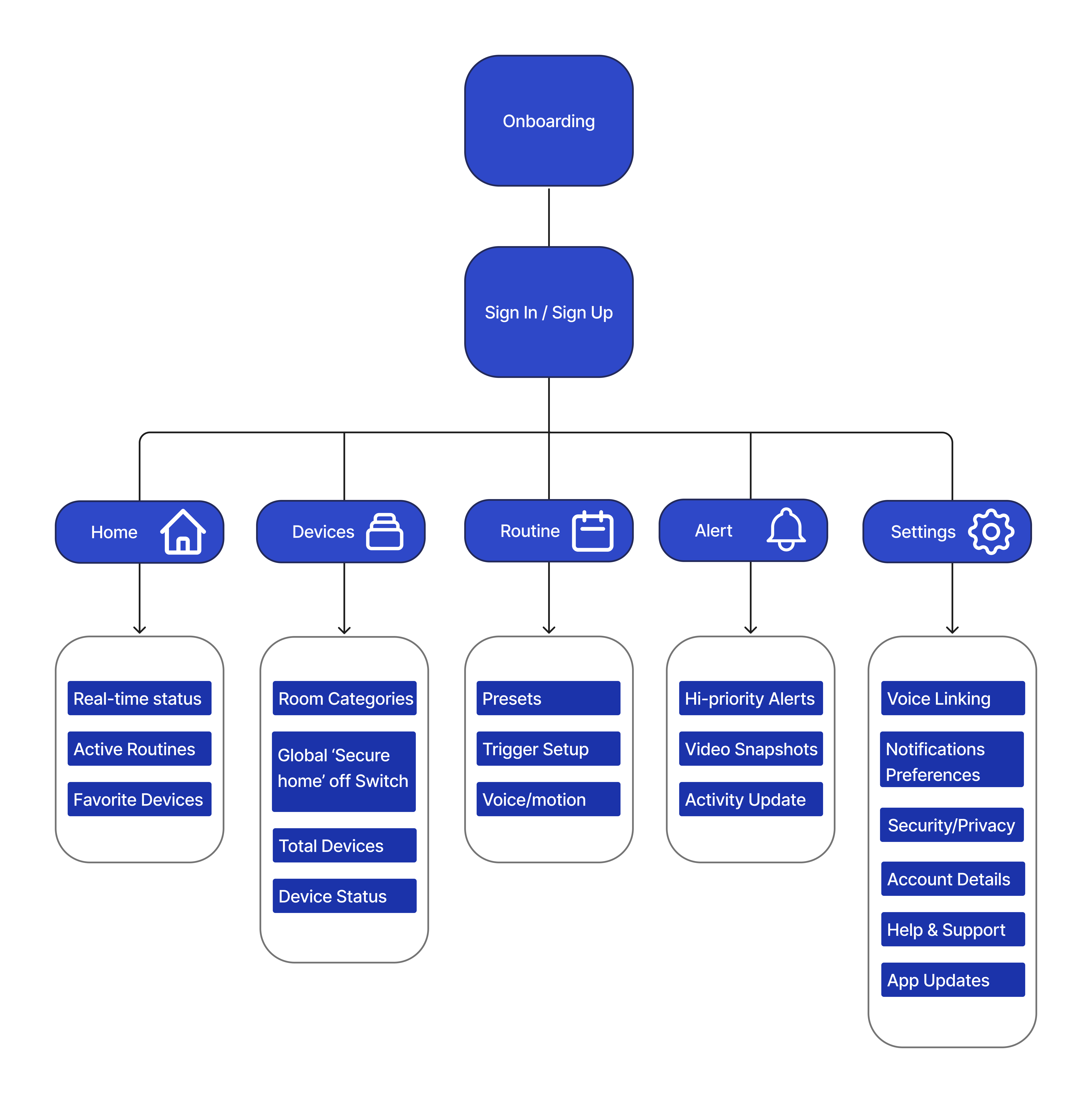
The app was organized around five core areas: Home, Devices, Routines, Alerts, and Settings, keeping the main experience clear and easy to navigate.
05 / Early Design
Tool used: Figma
Low-fidelity wireframes were used to work through the dashboard hierarchy, five-part navigation, and routine setup flow before adding the final visual system.

Onboarding
 0102
0102Home Dashboard

Devices
 03
03Routine Setup

Alert

Settings
What this stage helped define
Worked out how home status, routines, and important updates should be prioritized on the main dashboard.
Established Home, Devices, Routines, Alerts, and Settings as the main areas of the app.
Defined the steps for moving from routine selection and setup to activation.
06 / Visual Direction
Tools used: Adobe Illustrator · Figma
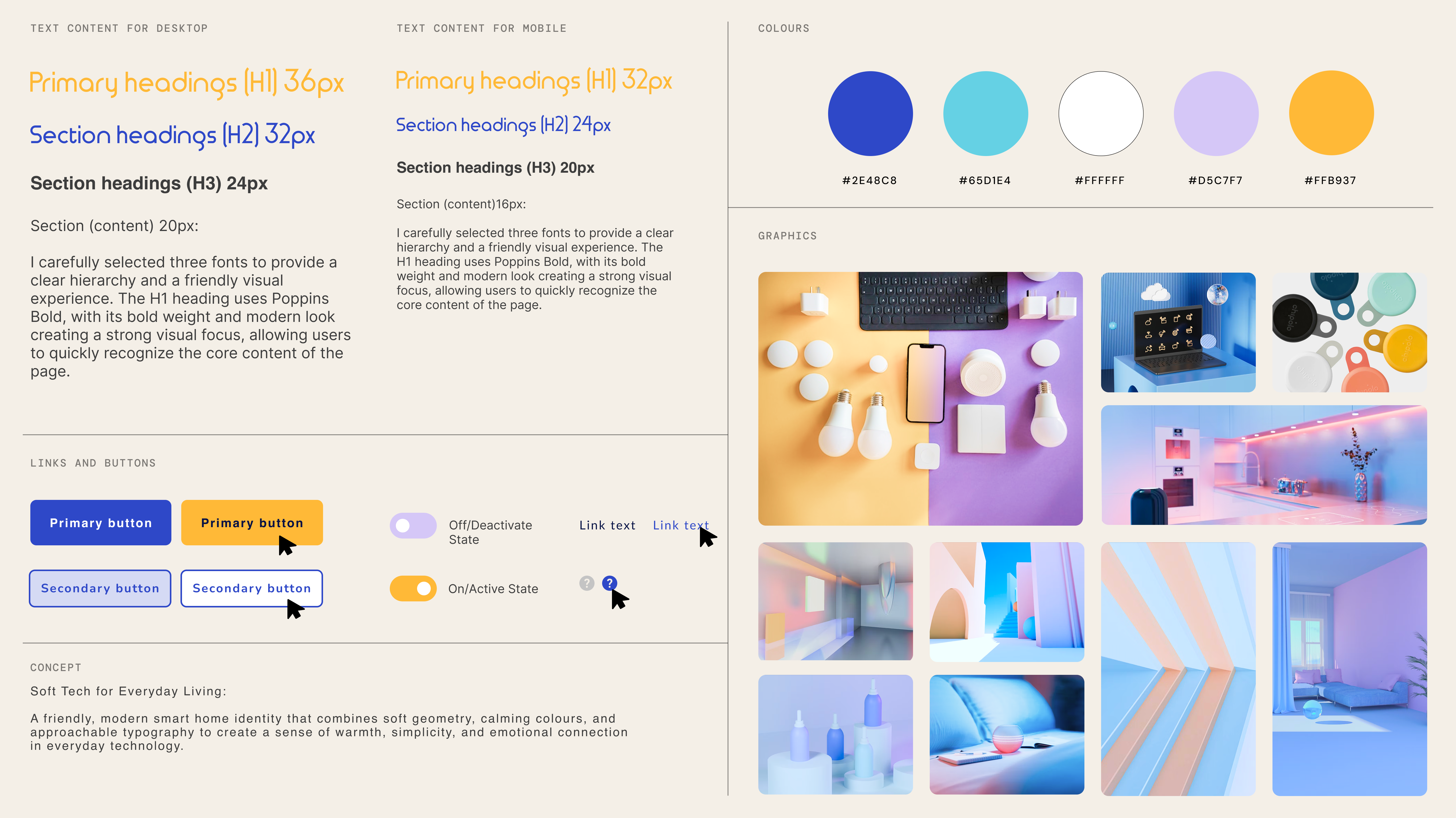
The visual direction shaped Omvia into a softer smart-home experience: calm instead of clinical, familiar instead of technical, and reassuring at a glance.
Keep the language clear and the visual cues soft, so the experience feels reassuring rather than technical.
Organize the experience around everyday rooms and routines instead of making people manage one device at a time.
Keep important home, safety, and caregiving information easy to find and understand.


Why The Home Pulse
The Home Pulse was chosen because the house shape made the smart-home purpose immediately clear, while the pulse line connected to safety, routines, and Wellness Checks. The Routine Loop communicated connection, but felt more abstract.
#2E48C8
Key actions and primary UI elements.#D5C7F7
Adds a softer, more relaxed feel.#65D1E4
Adds freshness and subtle highlights.#FFFFFF
Keeps layouts open and breathable.#FFB937
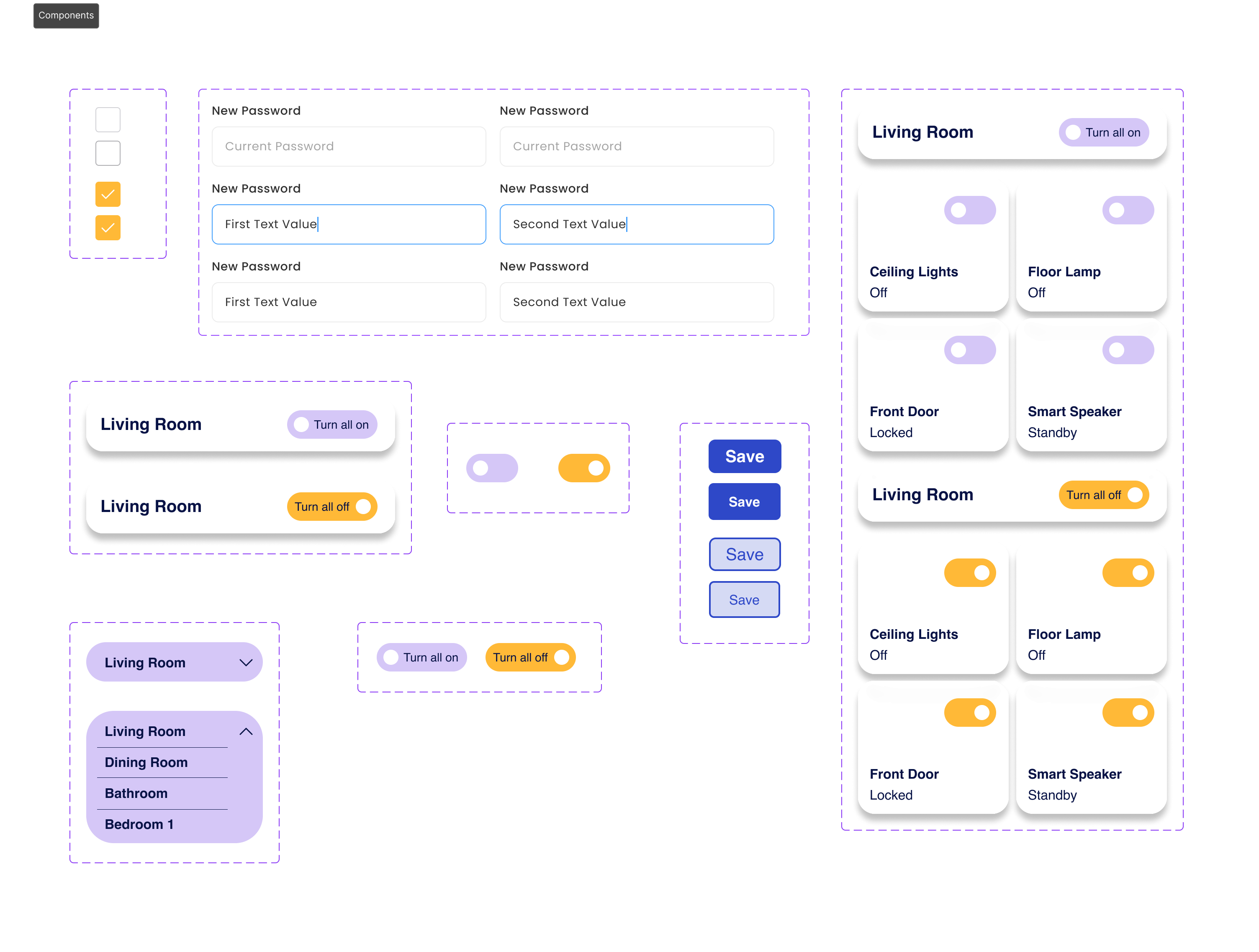
Highlights important states and actions.Reusable components were created to keep controls, states, and room-based device management consistent across Omvia.
Visual research focused on interfaces and imagery that felt calm, approachable, and trustworthy rather than highly technical. References were collected around soft colour, rounded forms, clear hierarchy, and subtle status cues to shape Omvia’s soft-tech direction.
07 / Final Experience
Tool used: Figma
The final interface brings the core flows together across onboarding, routines, devices, settings, and alerts, with more space for the product itself to take focus.
Guides users from introduction and device setup to secure sign in.
Brand Entry
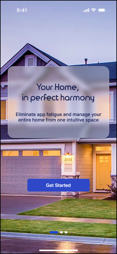
Welcome
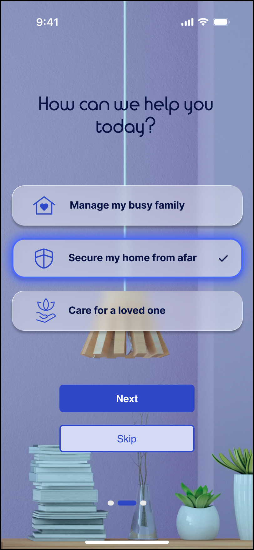
User Need
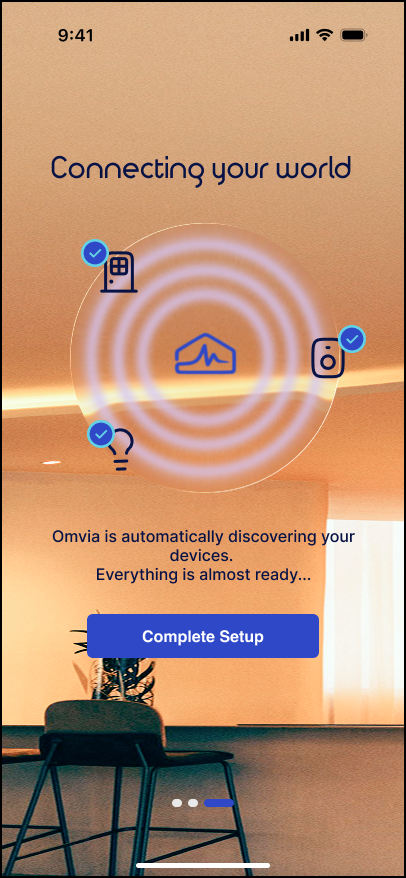
Setup
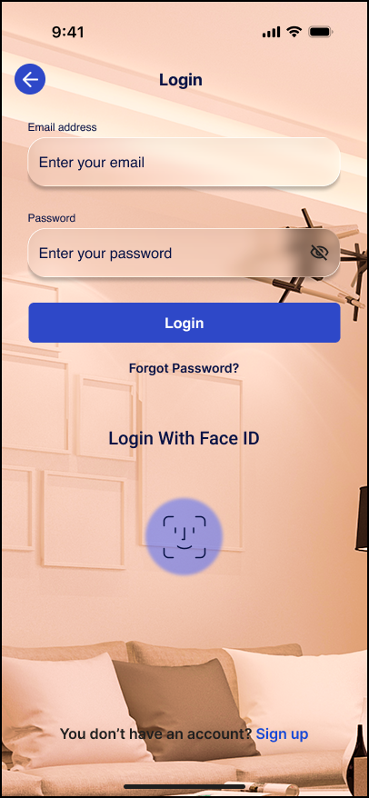
Sign In
Brings repeated device actions, custom triggers, and Wellness Checks into one setup flow.
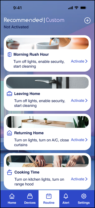
Routine Hub
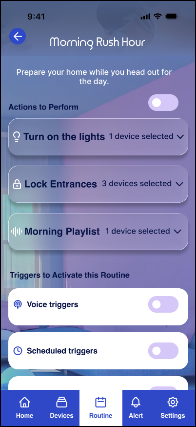
Morning Rush
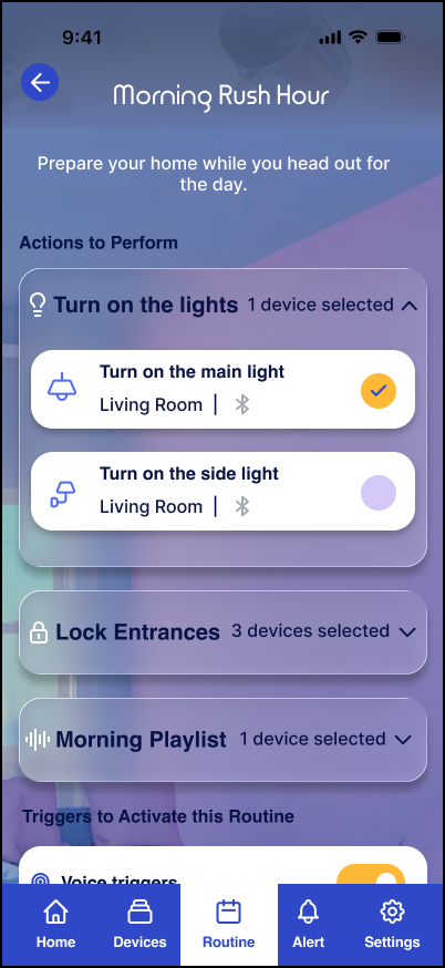
Routine Detail
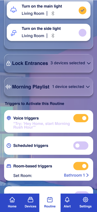
Triggers
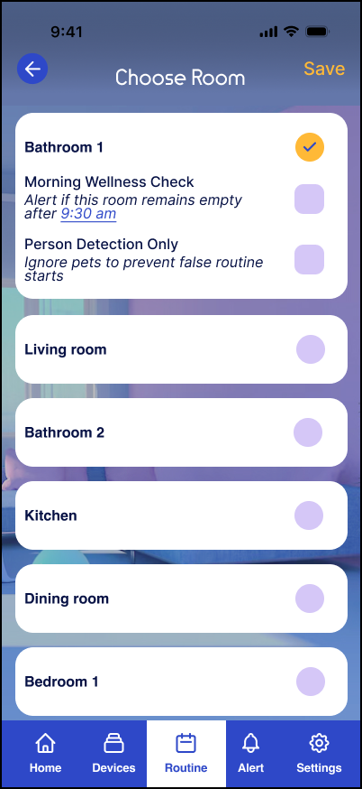
Wellness Setup
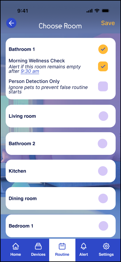
Room Selection
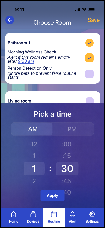
Schedule
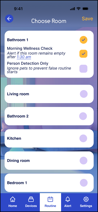
Review
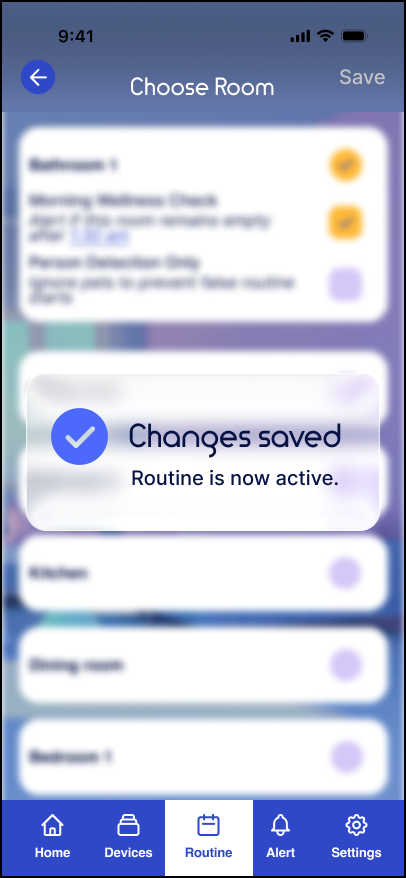
Active
Organizes connected devices by room and provides a clear way to secure the home.
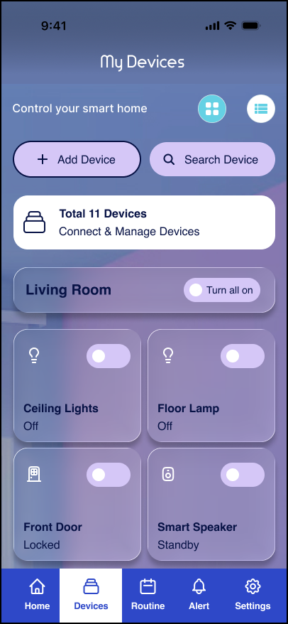
Grid View
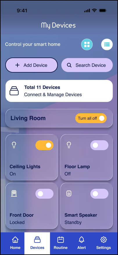
Active Controls
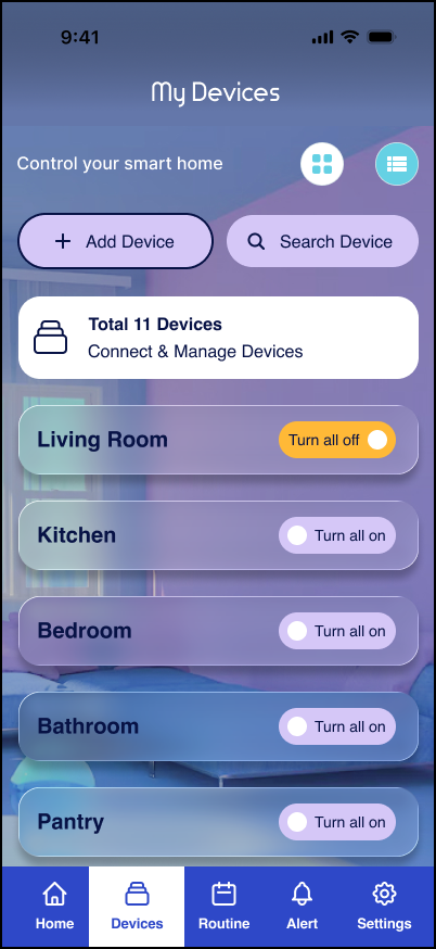
List View
Brings account security, access, voice assistants, and privacy controls into one place.
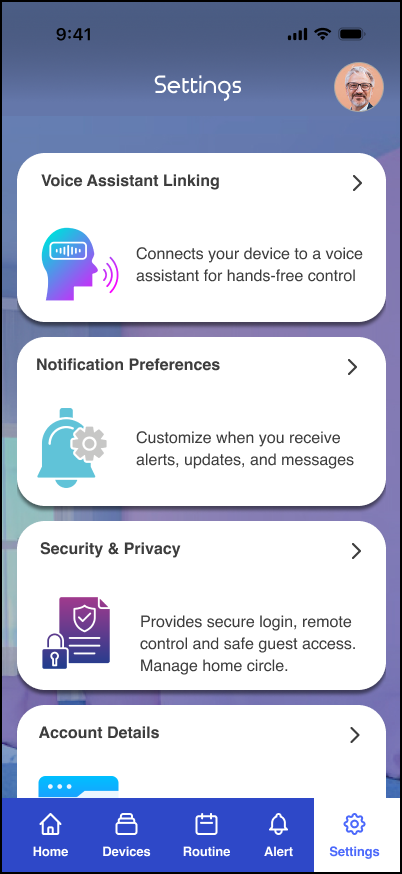
Settings Home
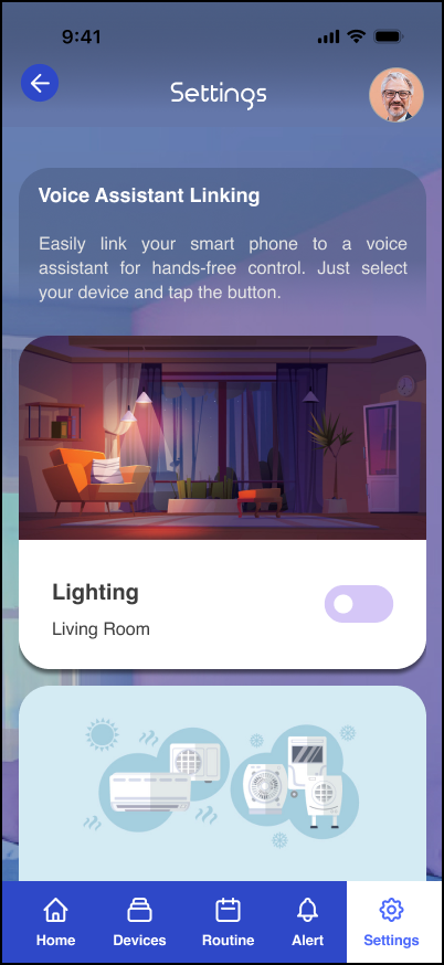
Voice Assistant
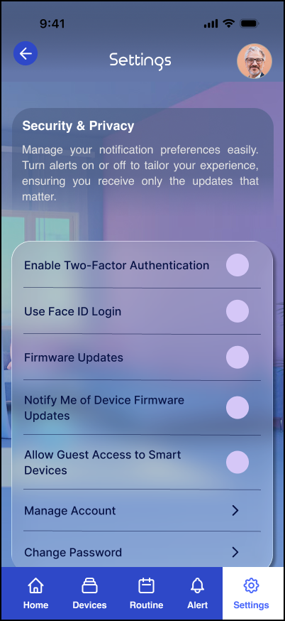
Security
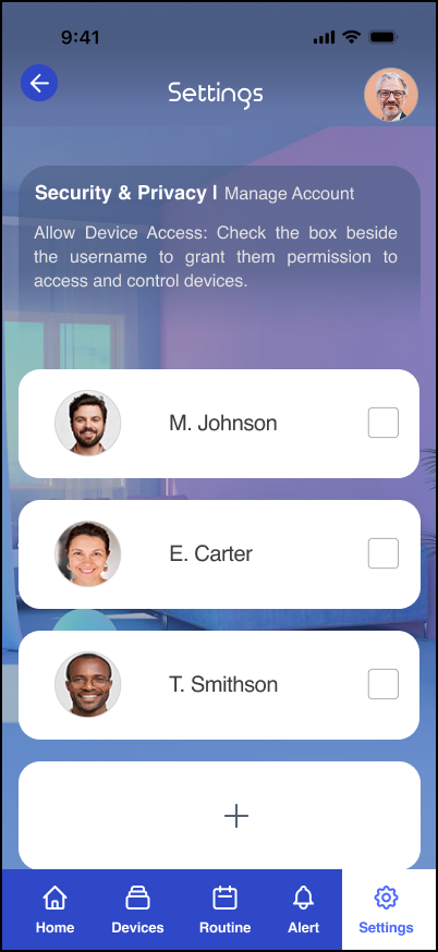
Access
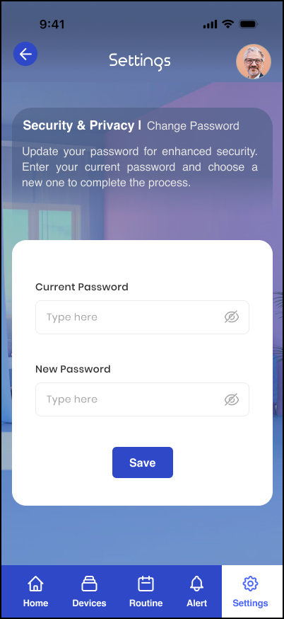
Password
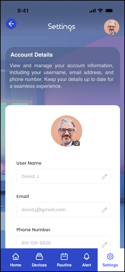
Account Details
Helps users understand what happened, judge urgency, and respond quickly.
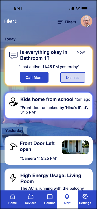
Alert
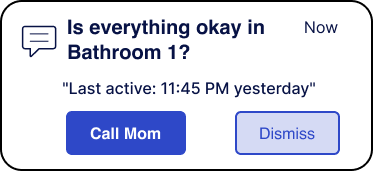
Respond
08 / Testing
Tool used: Maze
The prototype was tested in Maze with 20 participants across three key tasks to identify where people hesitated, got stuck, or needed clearer feedback.
You’re at the airport and forgot to lock up. Find your devices and secure the home in under 5 seconds.
Up from 65%
You receive an alert about your parents’ morning activity. Check how urgent it is and make a quick call.
Up from 80%
It’s a busy morning. Go to routines and activate the Morning Rush routine in under 4 seconds.
Up from 70%
“I find it hard to manage my mom’s safety alerts. The text is difficult to read on the move, and since all alerts look kind of the same, I can’t quickly tell what’s urgent.”
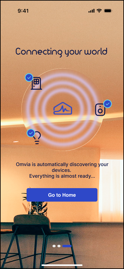
“I finished setting up my devices and tapped Go to Home, but was taken to a login screen. It felt confusing.”
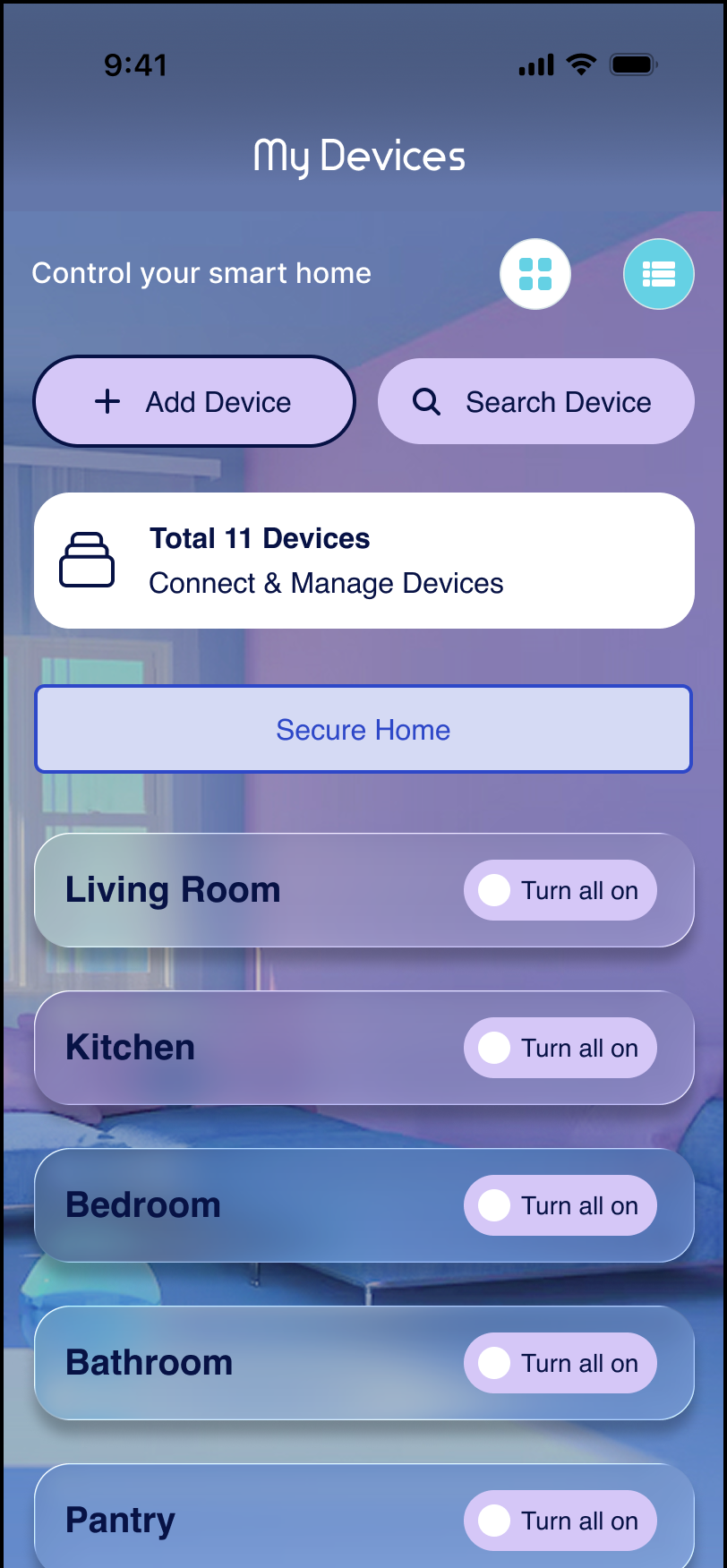
“The Secure Home button at the top feels a bit intimidating. I’m worried I might tap it by accident and shut everything down.”
Feedback was grouped into three design priorities:
09 / What Changed
Tools used: Maze · Figma
Testing led to three direct changes: clearer alert priority, clearer setup language, and a safer Secure Home action.
Users needed clearer home-status information and a better way to distinguish urgent alerts. The revised design improved status styling and used colour to make urgent updates easier to spot.
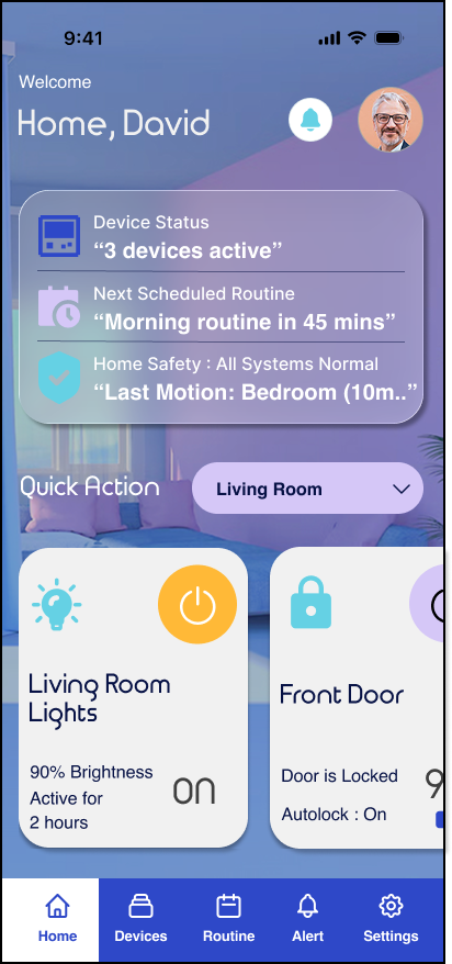 01
01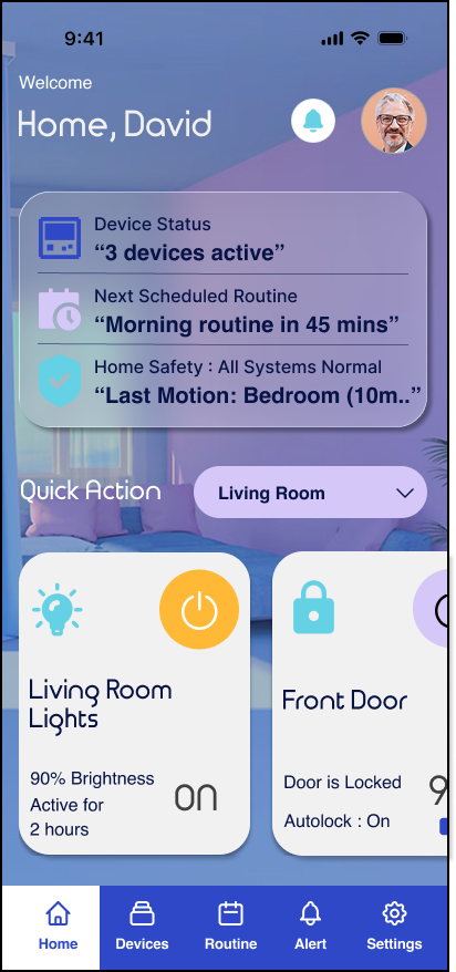 01
01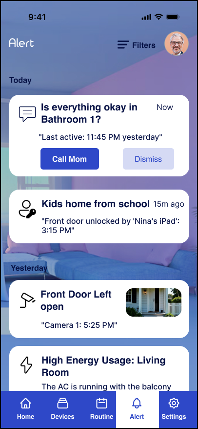 02
02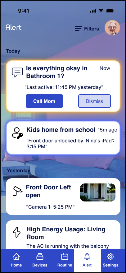 02
02“Go to Home” suggested setup was finished when it was not. Changing the CTA to “Complete Setup” made the next step clearer.
 03
03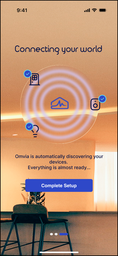 03
03Users worried about triggering Secure Home accidentally. Moving the action lower and adding confirmation made it feel safer and more deliberate.
 04
04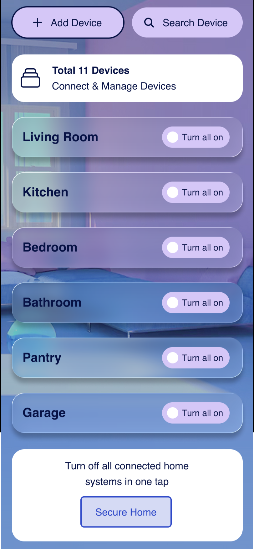 04
0410 / Outcome
Omvia evolved into a clearer smart-home experience centered on routines, remote reassurance, and supportive caregiving. Testing with 20 participants improved success across all three key tasks, including remote safety from 65% to 92%, caregiver alerts from 80% to 100%, and routine activation from 70% to 100%.
View Prototype ↗Omvia Case Study
by Esther Odeyemi